

we were asked to either choose an already existing game or a made up game to create or redesign an interface for.
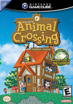
i chose the game 'Animal crossing: city folk' to re-design.
animal crossing is a sort of slice of life game. it simulates a more fun, childish and simplistic version of adult life. you are made to gather your own money, by selling anything you can get your hands on. once you get this money you can choose to either spend it on furniture to furnish your house or to pay of your mortgage.
in the later, more newer games in this franchise you are able to by things such as 'designer' fashion, hairdressing or coffee.


 http://www.videogamesblogger.com/2008/12/08/animal-crossing-classic-gamecube-review-nintendo-debuts-its-sim-life-communication-series.htm
http://ds.neologasm.org/animal-crossing/
http://wn.com/Animal_Crossing:_City_Folk
when not in the inventory there is always a clock in one corner of the screen with the date and day.
they all seem to follow similar colour schemes yellows with browns or greens. and yet again use the circle or rounded theme
animal crossing is a sort of slice of life game. it simulates a more fun, childish and simplistic version of adult life. you are made to gather your own money, by selling anything you can get your hands on. once you get this money you can choose to either spend it on furniture to furnish your house or to pay of your mortgage.
in the later, more newer games in this franchise you are able to by things such as 'designer' fashion, hairdressing or coffee.
the very first animal crossing was originally released in Japan on the Nintendo 64. but latter came out on the Nintendo gamecube in English.
wild world and city folk came after. and there is now another game in the early stages of making.
each game have all had similar styles. weather it be in graphics, game play or interface.
all of the interfaces have very distinct similarities. the use of circles and light colours is very common but in the middle one kind of brakes the tradition as the colours are a bit more vibrant. but it still keeps the circle theme


http://ds.neologasm.org/animal-crossing/
http://wn.com/Animal_Crossing:_City_Folk
when not in the inventory there is always a clock in one corner of the screen with the date and day.
they all seem to follow similar colour schemes yellows with browns or greens. and yet again use the circle or rounded theme


i started by sketching up two different ideas for my interface.
because of the use of rectangles in wild world i decided i wanted to bring them in a bit more.
so both of my designs had squares in them.
in the second design i tried to bring the clock aspect in like in city folk.


but i don't like the clock from either of my sketches.
in the first animal crossing they use circles to put the date and time in. i wanted to use this as well, so i adjusted it to what i felt was better, by using less circles
 |
| with the menu down |
 |
| with the menu up |
 |
| interface separate |
overall i like the outcome of my redesign
it doesn't take up much of the screen, so you are still able to see allot of your surroundings.
No comments:
Post a Comment