to gain a better understanding on game interfaces we were asked to research into good and bad game interfaces. the games in which i researched into were some flash games i had found on the internet.

the first example was a flash game i had found on http://www.flashgames247.com/play/5929.html
it was a game in which you had to serve penguins food and earn enough money throughout the day.
the interface is simple though a bit confusing at first glance. the orange numbers in the right hand side is the amount of money you are required to earn in that day of the game. and the green is the money you have reached.
though at first look there is no indication as to what the orange one is. the green numbers are quite obviously your money as it is on the cash machine. whilst playing through the game you come to understand what exactly it is the orange is. personaly if i were to create the interface for this game i would have had the goal away from your actual money and have it say on a clip board saying goal. it may be strait forward but its fast and simple to know what it is though i liked this interface very much
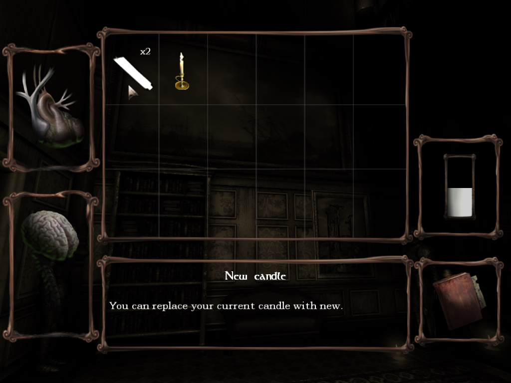
since im looking at game interfaces i thought it would be best to look at allot of different game interfaces. not just from a flash game.
i chose a pc game called amnesia: dark decent
its an indie horror style game.
the interface is incredible simple.

aside from the inventory of the game that shows you your health, sanity, notes, oil and items you've picked up.
In the actual game play there is nothing in your screen aside from a dot in the centre that may change to a hand if there is something you can interact with.

since im looking at game interfaces i thought it would be best to look at allot of different game interfaces. not just from a flash game.
i chose a pc game called amnesia: dark decent
its an indie horror style game.
the interface is incredible simple.
aside from the inventory of the game that shows you your health, sanity, notes, oil and items you've picked up.
In the actual game play there is nothing in your screen aside from a dot in the centre that may change to a hand if there is something you can interact with.

i like the simplicity of the interface and it makes being able to see your surrounding allot better since there is nothing to get in the way. but it could also improve by adding in a bar on the side or something to show you how much sanity or health you have. as it does get a bit irritating not knowing.
overall i have come to discover that most game interfaces are quite simple and there aren't many parts to it.
and despite the fact that they are simple its okay because they are quite self explanatory.
No comments:
Post a Comment